Branding
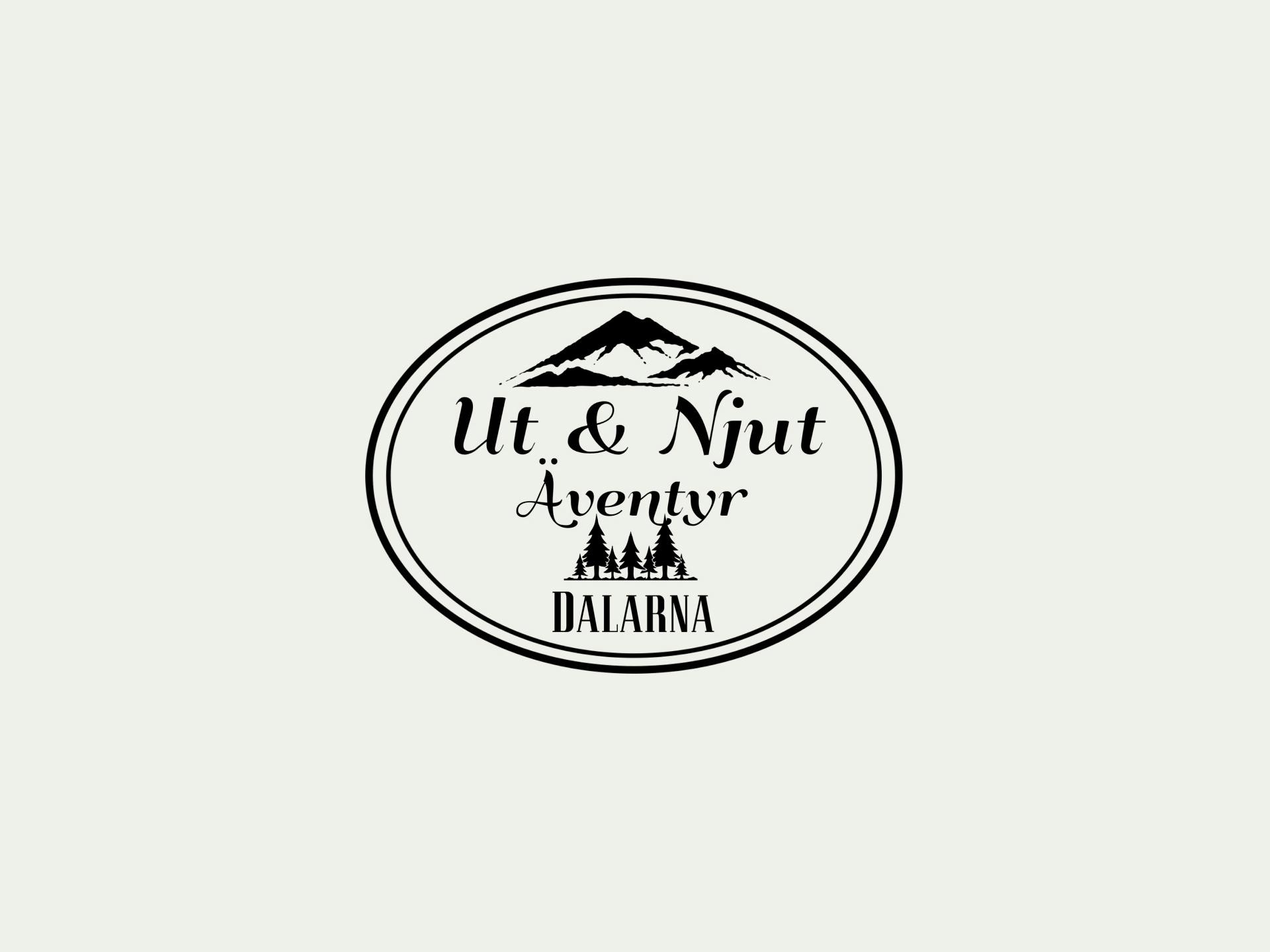
Ut & Njut. A new face for a nature tourism company.
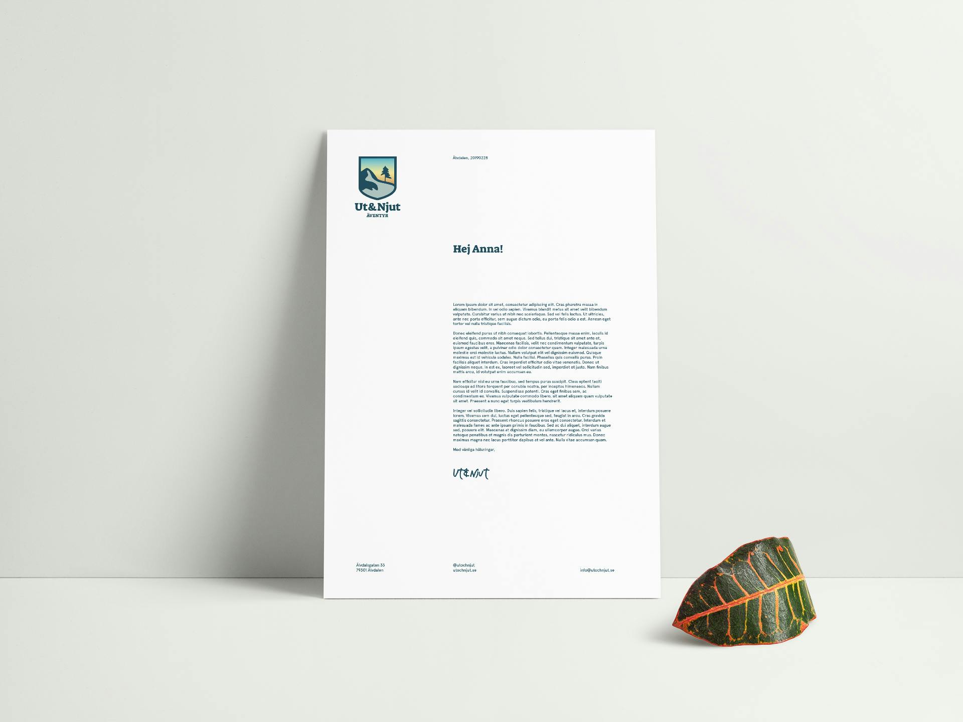
Ut&Njut is a nature tourism business located in Älvdalen, Dalarna. Founded in early 2018, the company specializes in nature tourism, hiking, outdoor activities and mountain safety. The logotype used from the start was created by the owners, but they quickly realized it was hard to work with and sought for a more professional looking identity. Therefore, they reached out to Sahlsa (where I was an intern) for help.
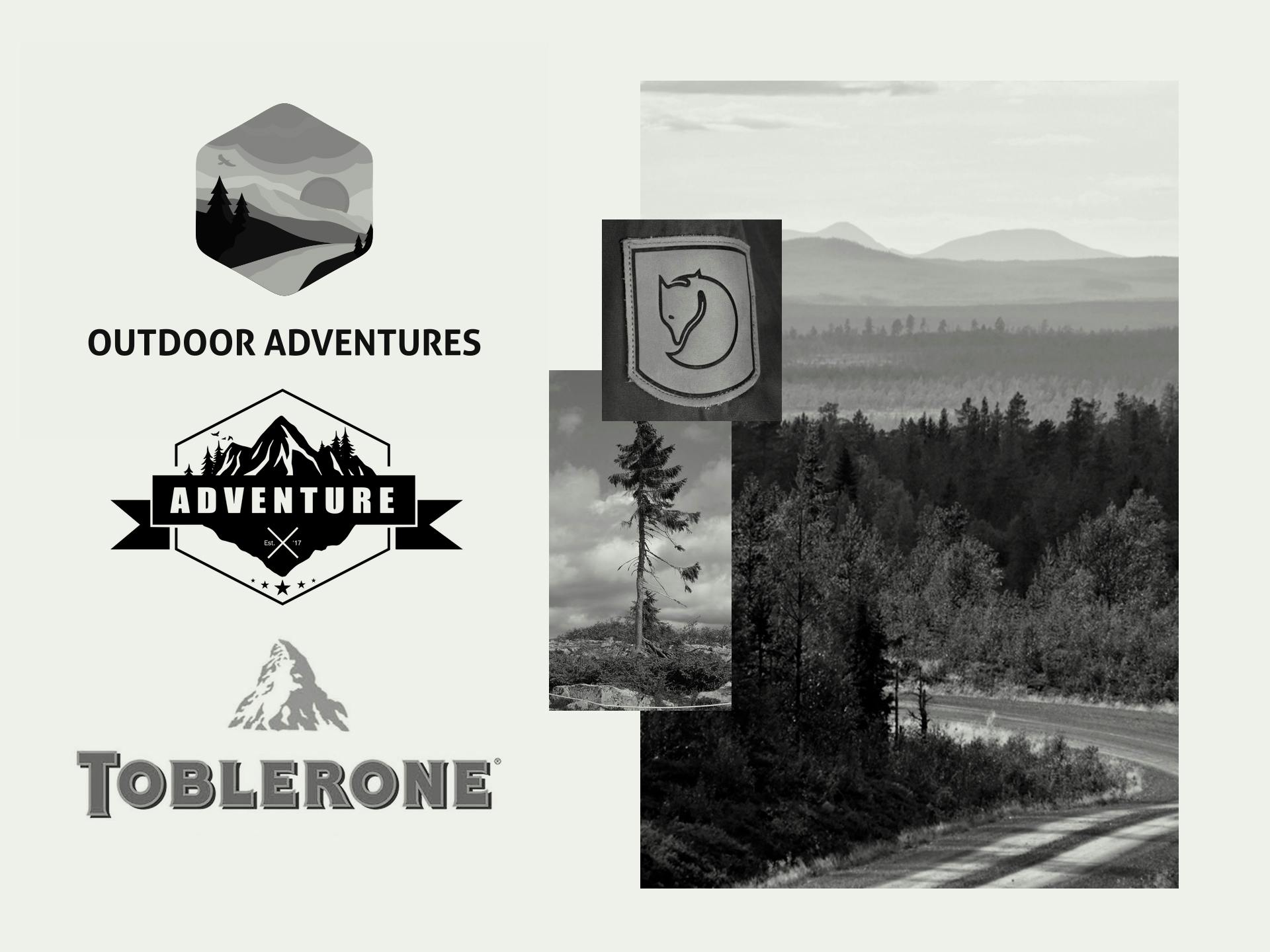
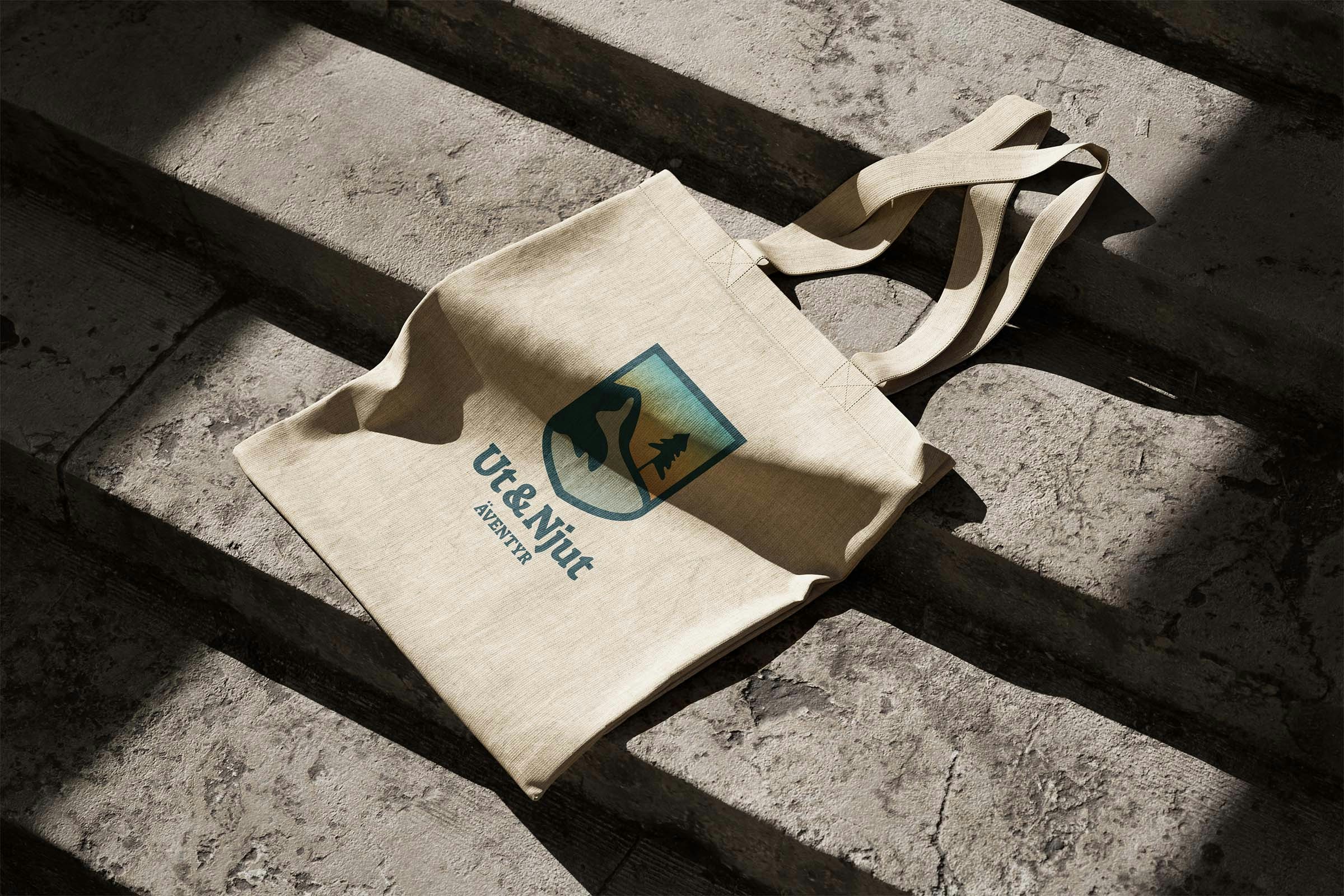
I began the project by conducting thorough research on the company, including a review of their social media accounts. Early on, I envisioned combining two elements from the existing logotype into a single design, shaped like a traditional patch, reflecting the owners' background as former scouts. During my research, I discovered that the world's oldest known tree, Old Tjikko, is located near Älvdalen, which inspired me to incorporate this tree into the new logotype.
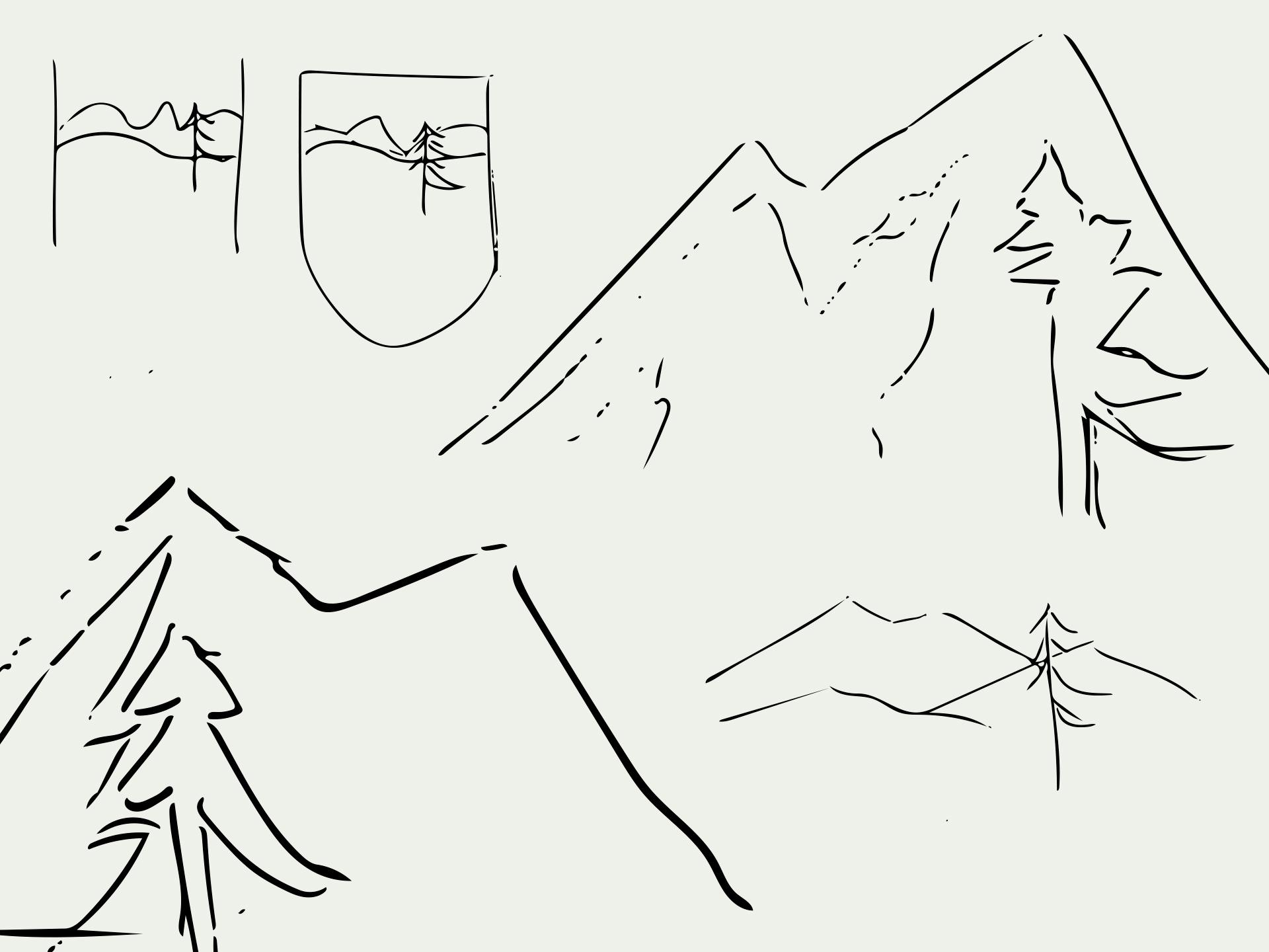
I started by sketching several concepts that included Old Tjikko. Concurrently, I created a mood board to visualize the direction I intended for the logotype, drawing inspiration from iconic brands such as Fjällräven and Toblerone.
Throughout the process, I experimented with various styles, including simple line art and slightly more detailed yet clean designs. My goal was to ensure that the final logotype would be versatile and look appealing on different materials. However, both my supervisor and I felt that the initial line art sketches were too minimalistic. Therefore, I decided to integrate a more hand-drawn element to enhance the design's character and depth.